Introduction
When I started my fellowship, I was excited to see how I could leverage programming to bring awareness to the necessity of community involvement in the refugee resettlement process. Before this summer, my understanding of refugees was solely based on what I saw on national news. It was when a friend of mine, who was an English tutor to refugee children in the New Haven area, spoke of the lack of volunteers and school supplies that moved me to contribute to the issue locally in whatever way I could. As a second-year computer science and art student, I was eager to pick up web development and data visualization despite having no prior experience. Fast forward several months later, I was able to work with community organizations and learn how data drives decision making in refugee resettlement programs. The following report details how I learned about the impact of data visualization at the Integrated Refugee & Immigrant Services (IRIS) and on my own.
Understanding Refugee Resettlement with IRIS
In order to learn more about New Haven’s refugee population, I reached out to various experts and organizations, including IRIS. By serving as a research fellow with Ann O’ Brien, Director of Community Engagement at IRIS, I learned that the refugee resettlement process relied heavily on community support. Although the cooperative agreement from the federal government allocates funding to resettlement agencies like IRIS, it is too little to successfully set up refugees to be self-sufficient. To meet the many clauses of the agreement, resettlement agencies would have to raise most of their funds from community donors and rely on volunteers. I was also surprised to find out that the financial assistance was a flat amount regardless of the cost of living of where the refugee was placed. In summary, the federal government requires a large number of legal terms but a small amount of support. A refugee’s chance for successfully starting a new life in America was heavily dependent on the community they were placed in.

Once I understood the relationships between the various groups that coordinated the refugee resettlement process, I was able to start working with data about IRIS’s refugee arrivals. Although I cannot share the data visualizations I created due to confidentiality, I want to share a couple things I learned about how data impacts programming in the resettlement process. By observing changes in factors like nationality, age, and gender, IRIS is able to tailor the support they offer to their arrivals’ particular needs. For example, an increase in Syrian refugees, which included many female clients, necessitated more English programs. While Syrian men usually knew English, Syrian women did not as they could not go to school due to Taliban rule. Also, since they were not allowed to go out unaccompanied, they would need support to accomplish tasks such as grocery shopping. In addition to gender, age was used to determine educational needs. Clients between the ages zero and five required IRIS to find pre-schools, which are not state guaranteed, or make sure someone is taking care of them at home. The next age grouping, five to eighteen, indicated the amount of school placements needed. These are just a few examples of how IRIS and other refugee resettlement agencies might use data to shift their programming.
Learning Data Visualization
In addition to doing research at IRIS, I taught myself the basics of data visualization, identified the available databases about refugees, and generated a choropleth map representing refugee arrivals in the United States. Per the recommendation of Professor Rushmeier of the Yale CS department, I used the textbooks Interactive Data Visualization for the Web by Scott Murray and Visualization Analysis & Design by Tamara Munzner. I read the former to learn about technical implementation and the latter for designing effective data visualizations.
Using Data from the Refugee Processing Center
After I understood the fundamentals, I worked on creating a choropleth map based on data from the Refugee Processing Center (RPC). Operated by the U.S Department of State Bureau of Population, Refugees, and Migration, the RPC’s website hosts data on the number of refugees admitted to the U.S. Refugee Admissions Program by country of origin. Interestingly, the site’s reports that categorized refugees by age group and gender and other interesting datasets are no longer available. In addition, an interactive reporting feature on the site that allowed visitors to view visualizations of refugee resettlement by state was also disabled. The RPC did not respond to my inquiry on why this information is no longer provided. When this data was still available though, I was able to see that roughly half of refugee arrivals were under the age of 18 or in other words, primarily children. In addition, male and female refugee admissions were about equal. Lastly, I noted that the top three refugee native languages were Arabic, Nepali, and Somali.

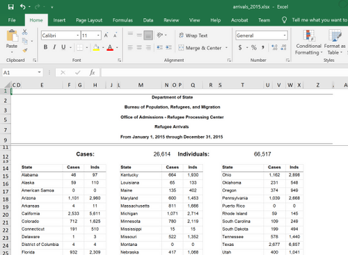
To get my choropleth map to properly generate, I cleaned a dataset from the RPC site and did some debugging in d3.js. In its original form, the data file was an Excel spreadsheet that displayed a table of the number of refugee arrivals in all American territories in 2015. To format the data so my program could properly read it, I prepared a CSV file that included “state” and “value” pairs for all fifty states. Although I was happy when my dataset was properly used by my program to generate a choropleth map, I realized the linear color legend I was using did not offer enough granularity. States like California and Texas, which had refugee arrivals in the six thousands, skewed the scale so that most states, which had refugee arrivals less than or around one thousand, could not be differentiated. Thus, I changed the color scale so that more ranges are offered. The final map is displayed below.


Choropleth map representing refugee arrivals from January 1, 2015 through December 31, 2015.
Reflection and Future Directions
Carrying out my Andy Keidel Fellowship project this summer, I had to overcome new challenges posed by the Covid pandemic. While my original proposal envisioned that I would be on the ground connecting with the local refugee community in New Haven, the quarantine environment forced me to gather information remotely. Although I learned a lot by talking to experts and organizations over phone calls and Zoom meetings, I would still like to connect with my community and learn more through in-person experiences in the future. For instance, my advisor at IRIS would have wanted me to shadow staff and see how IRIS works with refugee families to integrate them into the community of New Haven and greater Connecticut if conditions had permitted.
In addition to working remotely, I learned that I am not as good as teaching myself complex programming languages and concepts as I had originally imagined. While I was able to pick up the basics of data visualization design and programming, it is no replacement for rigorous academic instruction and practice. Thus, I look forward to taking Data Visualization at Yale next year despite having gone through the course textbooks already. The benefit of learning on my own was that I was able to focus on data visualizations that interested me; this was valuable as I got to explore particular applications of the technology more in depth and I am excited to continue these independent studies into the future.
I would like to conclude this report by thanking the generous support of the Andy Keidel Fellowship and its organizers. For without them, this project would not have been possible.


